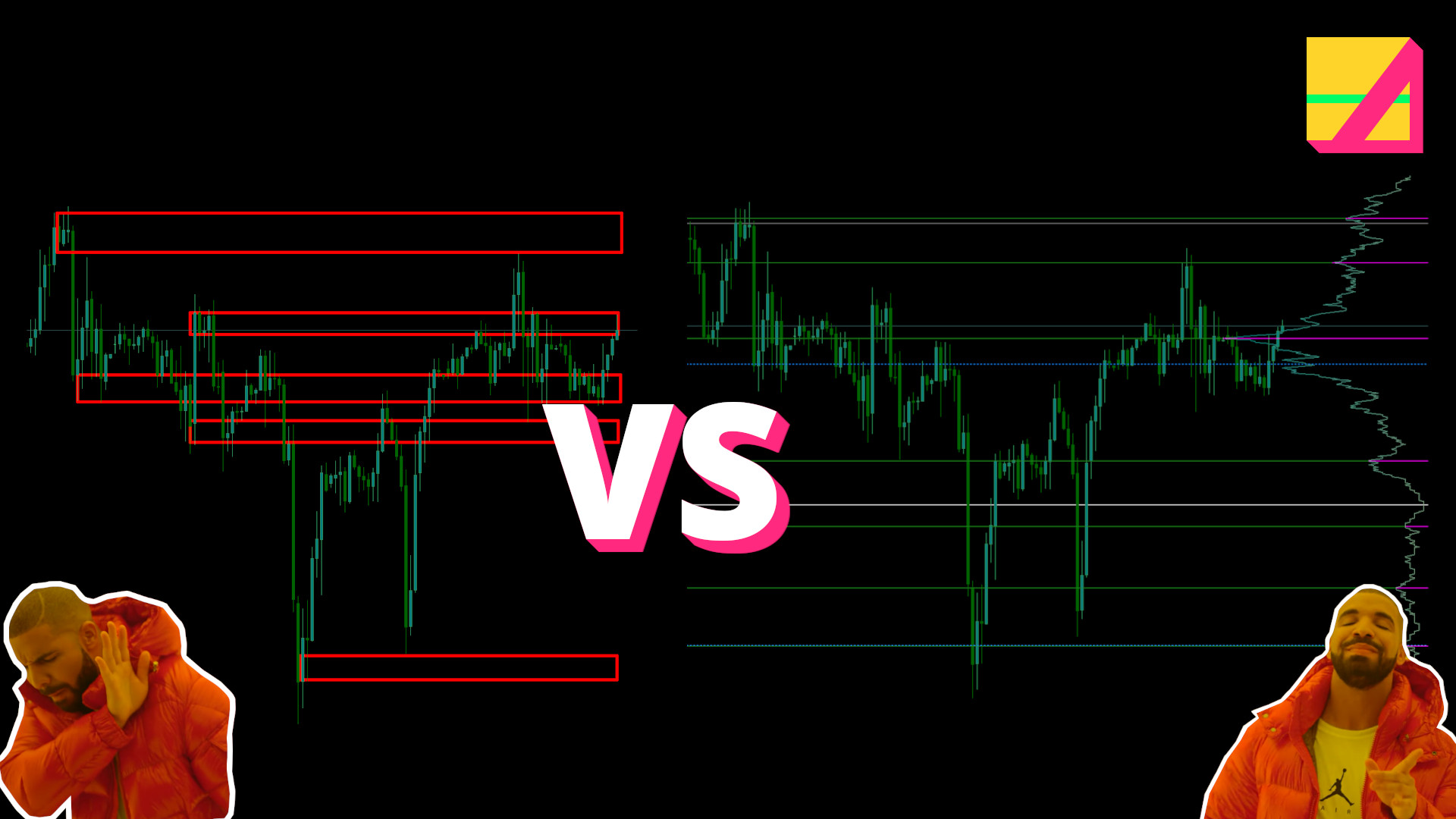
Why automate support and resistance plotting?
I’m on a quest. A quest to turn real world trading into code based auto trading. To do this I need a way to approximate and automate as many useful charting factors as possible.
First up is support and resistance. A major deciding factor for entries and exits.
Automating these saves time charting and shows you things you might have missed. This is a net benefit, provided it doesn’t over-report.
We’ve all seen Adam Grimes’ analysis on random lines on a chart hitting price at some point. Even still, it’s a line in the sand, a decision point, which, coupled with price action or other data, can lead to action. Which is what we want.
So many ways to approach this:
- Zigzag - needs “wave” to complete so ends up lagging too much to be practical
- Local maxima and minima
- Z-score, measured points where price reverts back on itself
- Manual plotting etc.
It’s tough to decide on the best approach as they are so subjective and rarely accurate to the pip, such that there’s never a moment you can say with certainty: this is where we need to enter.
Even with all of today’s algo trading volume in the markets, which accounts for some 60-70%, they say, in equities alone, you still can’t get pip-perfect reversals or breaks.
So for most traders they end up as zones. Liquidity areas. They go by many names. And even they aren’t even respected regularly enough to base a whole strategy on them.
They are lines in sand but the tide comes in every day. Twice. Three times if you count the Asian open.
But what happens if we don’t use them? We have no targets for profit, or retests for entries. We can’t confidently mark out ranges, channels or areas price is exploring.
If trading is an auction, and price has to find equilibrium before the hammer falls, half the battle will be in determining when the hammer is likely to fall.
But financial market auctions are no house or furniture auctions. There are dozens if not 100s of variables to account for. In a standard non-financial market auction, price doesn’t drop below the lowest price. In equities or forex, however, the auction includes supply and demand, through economic, random business transaction and political decision-making for not one but TWO assets.
So at it’s most basic there are four factors all interplaying. Supply and demand for the base currency and the same for the quote currency.
My indi tries to tease out those differences in supply and demand, seeking extreme divergences of those cumulatively, but it then helps to determine key levels for potential entries, exits and scale in points.
So I set out to try to automate these key levels.
SOLUTION 1 - Basic
First we plot whole numbers. I use a tweaked version of key_levels for MT5. I added 75/25 levels (others use 20/80) and a “10 pip mode” for some experimentation on lower timeframes.
TIP: use right-click > Open image in new tab - if you want more detail.
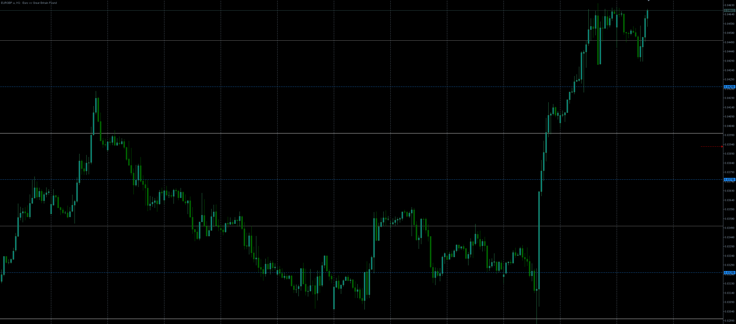
This one’s nice and simple, and I will discuss how using these can simplify manual and automated trading in the future.
For now, this shows how, on H1 in this example, you can see price explore the whole numbers (thick white lines) and test the various other areas along the way.
As with normal Support and Resistance charting, multiple hits gives a clue as to the strength of the support or resistance in that area, but can also be affected by any economic or political or random business event occurring in real time. The huge spike after the test of 0.83 on EURGBP, for example, was the Bank of England rates decision, to raise from 0.25 to 0.5. Consequently it blew through the previously tested 0.84 level, as the GBP dropped against the EUR. There are a number of variants on this, including trading the 10 pip whole number gaps on M1 or wider 100 pip levels on higher timeframes - but that’s for another post.
SOLUTION 2 - Advanced
The next way to automate Support and Resistance plotting is to use Volume Profile. Again, I modified the best MT5 indicator for this so that it only updates once per bar - no need to update every tick, perfect to leave running, with low system resource use. I was using some well-aged hardware previously and so got into the habit of optimising everything.
It’s called VP-range-v6 in metatrader. There’s most likely one for ctrader and tradingview.
What is VP? Similar to its predecessor, market profile, it shows the volume traded at each price point, when it exceeds a certain threshold. This forms “nodes” and value areas that highlight where activity was highest in terms of tick volume.
It typically does this on a day to day basis. Gaps between nodes can be volume vaccuums, where you might expect price to move quickly before getting stuck again in high volume areas, suggesting the strongest market interest from bulls vs bears.
Is volume accurate in forex? That’s a question for another post, but please check futures (centralised) volume vs most brokers’ volume in tradingview vs your trading platform and you’ll see how closely aligned they are.
Steve at Paracurve did an analysis showing that it’s within a few % accurate. This is enough for us, especially as this technique aggregates many day’s worth of volume.
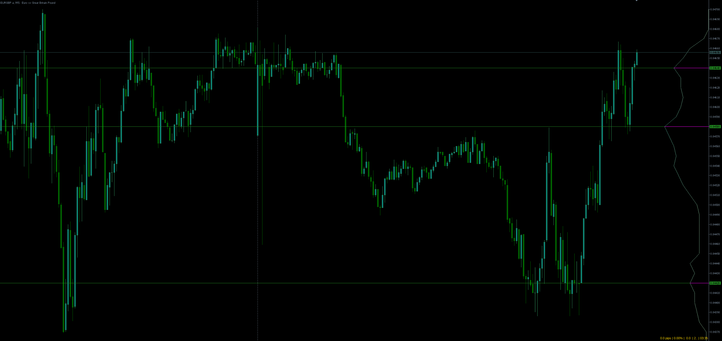
Now, I don’t use VP the standard way, showing a histogram for every day. I use VP over a range which in my case is the last 10 trading days, or 14400 minutes in my case.
Bear in mind it draws day to day, so what might look like a good level 5 days ago might not have been there at the time, depending on what happened afterwards. If it’s trending, then it’ll be clear what came when as new areas were explored (higher highs, etc.) within that 10 day window.
VP is especially good for well trodden areas. Where price has been ranging. Wholes and quarters are great for new areas with no recent history. Together they make a good pair for automating potential action areas for price.
No support or resistance drawing is 100% accurate, as we’ve said above. And of course most things you can see on the chart by eye or draw by hand. But if you want to plot ahead, or off-screen, or zoom in to the chart, it helps to have the lines drawn. It helps a lot to have them drawn automatically.
Given the subjectivity and randomness of the market, most traders who use them resign themselves to drawing out these areas, zones or liquidity pools and watching closely. If the level doesn’t hold, they move on to the next one. And this is our approach here.
The reality is that price areas are only tested temporarily, and you never know when a level will fail and explore towards the next. In other words, the point where the auction hammer drops changes constantly depending on innumerable events that no human could ever hold in their head and analyse consistently enough to profit from.
So we approximate. Then in my case I rely on strength indices to show when currencies diverge hard, suggesting a strong trend on higher timeframes or reversals on lower timeframes.
We use the approximated key price areas to place our entries and exits, in whatever form they take.
Take-away
This is essentially why I take a more relaxed attitude to S/R. The levels may not hold. What matters, in my opinion, is the strength differential between the currencies, as you can see mapped out in my indi below.
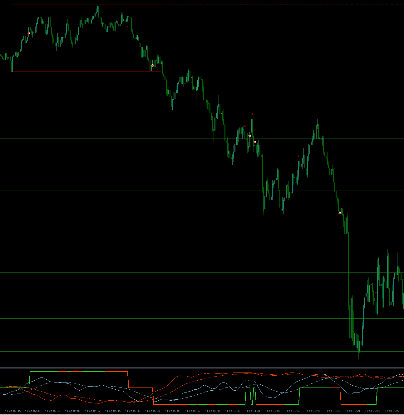
Here you see cable showing a reasonable divergence in currency strengths (bottom of image) while breaking out below the low of the Asia session into the start of London. This was also a whole number that got restested before the drop, at 1.36.
It came back to restest the quarter level (1.35750) which also happens to be a strong volume node from the last 10 days.
If they are diverging hard, it’s better not to try to revert it. Unless you are working a higher TF range and switch to the faster reversal mode like this:
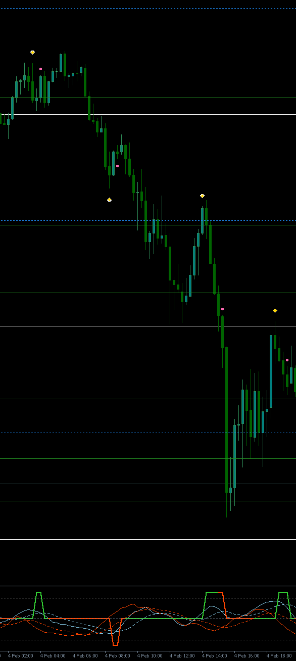
This shows M15 (above was M3) on the same chart, but with the reversal settings of the indi toggled on. Strengths diverged enough to flag reversals to the downside 3 times, and once to the upside, which would have failed, but would not likely have been taken as it is not occurring around a volume or whole number level.
As you can also see, reversals around volume profile and whole numbers typically overlap and act as reasonable confirmation that the market pours volume into these areas.
While the reversal style requires tighter stops, for better risk to reward ratios, it too relies on support and resistance for entries and targets, offering confirmation of reversals or retests for breakouts.
So that’s the top and tail of it. Don’t waste energy pouring your heart and soul into such precise levels. Map them out approximately and use other factors to determine your type of entry and approximate entry. Risk management controls your confidence in the levels. Which can also be automated!
If our goal is to simplify our trading, which in turn improves our performance, leaning on these tools to cover bases we might miss and be more consistent is the right direction to work towards.